
Website

Official Website Development Case Study for a Think Tank Research Institution: An Eastern Narrative in Chinese and English

Design and build a brand official website for a think tank institution focused on digital transformation and connectivity research: a deep-ink and gold-foil Oriental visual system, a consistent experience across PC and mobile, a bilingual Chinese-English content architecture, designed and developed by the HOLYPro team.

伏羲智库 Beijing 2026-10-11 上线
Official Website Development Case Study for a Think Tank Research Institution: An Eastern Narrative in Chinese and English
客户伏羲智库
行业与特点WebsiteMultilingualEducation
地区Beijing
上线时间2026-10-11
交付团队XiXi
访问案例

Project Background

Fuxi Institution is a non-profit research organization focused on internet development and digital transformation. It was initiated and led by Professor Li Xiaodong, former Director of the China Internet Network Information Center (CNNIC), and jointly founded with experts from industry and academia. It is dedicated to advancing digital transformation to narrow the digital divide and promoting interconnection to bridge network fragmentation.

We undertook the design and development of the institution's brand official website, covering both PC and mobile platforms and offering bilingual Chinese and English versions. From the visual system to the information architecture, the project was customized to the institution's positioning: it must carry serious research content while also conveying an Eastern cultural character.
Design Concept: A Restrained Expression of Deep Ink and Gold Foil

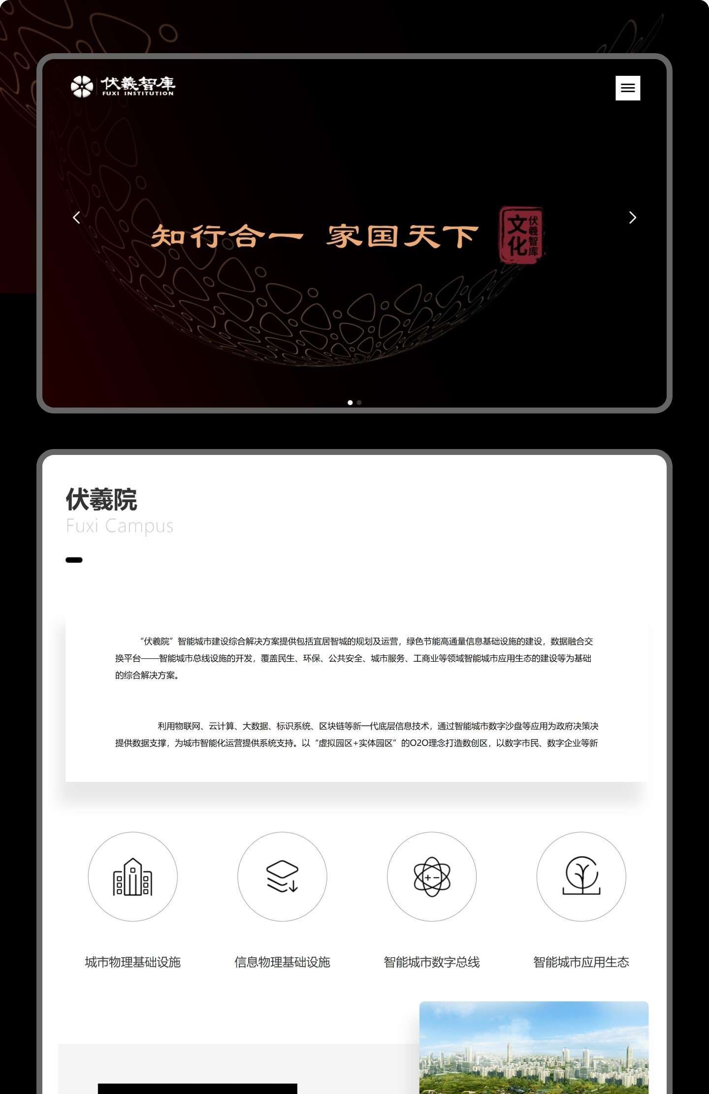
The overall visual uses deep ink as the base with gilded accents, combined with calligraphy and seal elements, translating the institution's philosophy of 「Unity of Knowledge and Action, Family and Nation Under Heaven」 into a perceptible interface language.

  • Color: Dominated by deep ink + warm gold, with cinnabar seals as accents, balancing authority and an Eastern temperament;
  • Layout: Symmetrical grids and generous white space bring core content such as the institution profile, research reports, and expert team to the fore;
  • Details: Seal carvings, gold-line curved surfaces, and other elements are used with restraint; decoration serves the atmosphere rather than piling up.
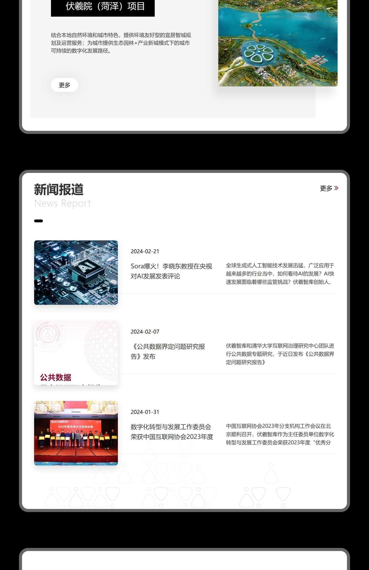
Official Website Hero Section and Institution IntroductionInstitution News and Expert Team

Information Architecture: Organizing Your Research Content Well

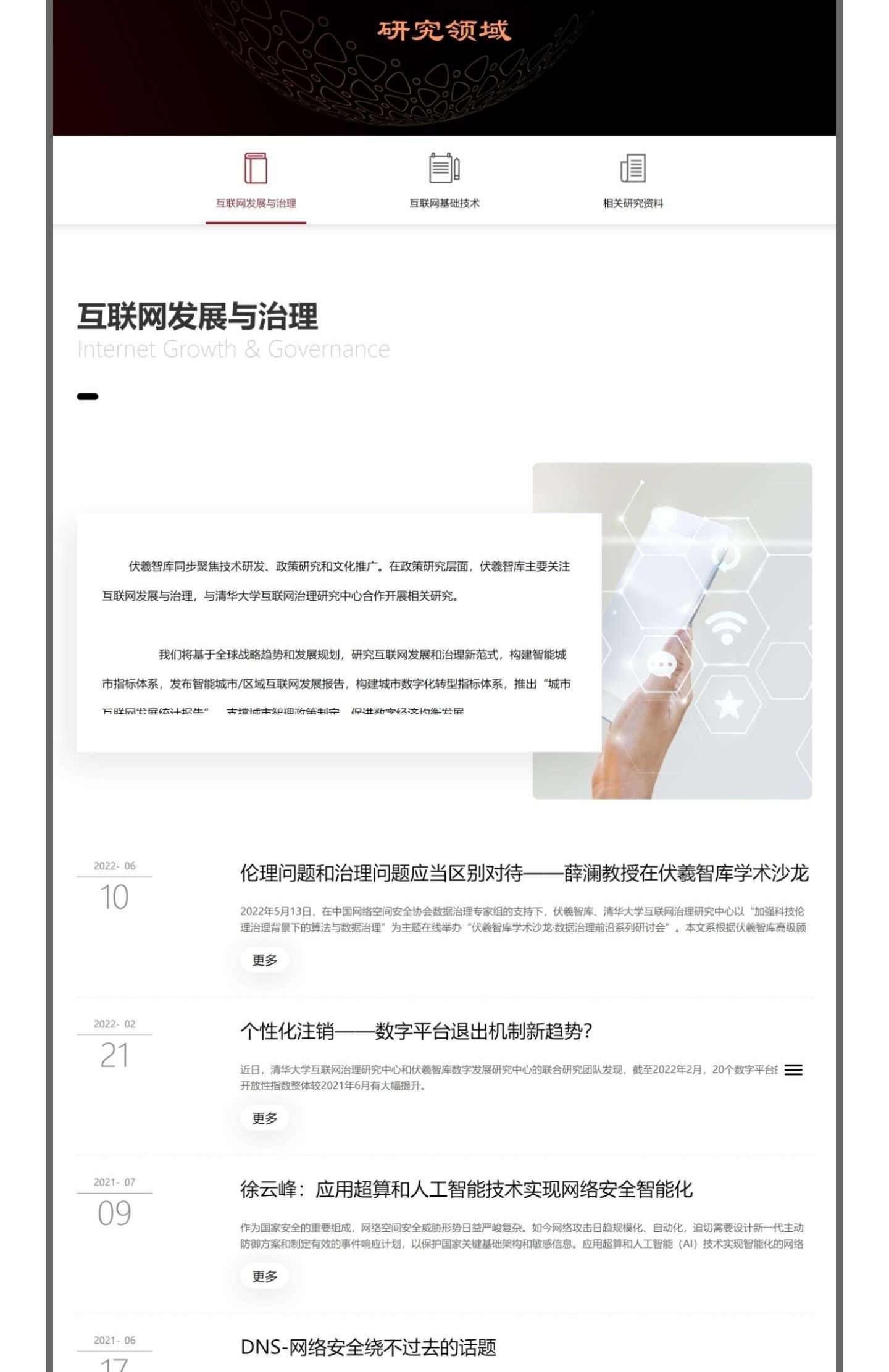
The value of a research institution's official website lies in the content itself. The homepage is arranged according to visitors' browsing habits: institution profile, news updates, expert team, research areas, research achievements and publications unfold layer by layer. On the long page, one screen holds one section, with a clear path.

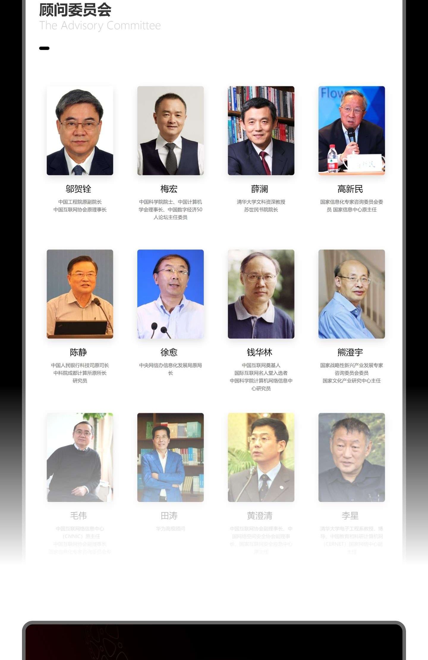
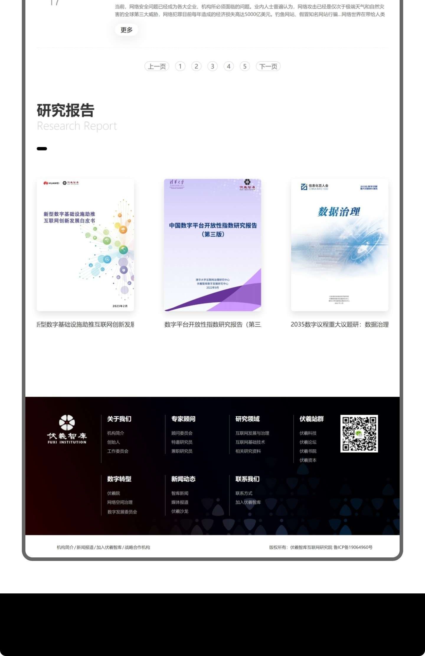
The expert team uses a unified avatar grid and title labels for quick identification; research reports and publications are presented as cover cards, maintaining reading continuity.

Research Areas and AchievementsResearch Reports and Publications

Multi-platform and Bilingual

The PC site and the mobile site share the same visual system. While retaining the deep-ink-and-gold character, the mobile version rearranges the navigation and grid to ensure a comfortable reading rhythm on small screens; the footer keeps the QR code and contact entry points for convenient partnership discussions.

The site offers both Chinese and English versions, and the two language versions share the same information hierarchy. The English version is not a word-for-word translation; instead, the institutional introduction and section copy have been rewritten in line with international communication conventions.

Contact Us and Footer

Our Views

The hardest part of a research institute's official website isn't "looking good"—it's "holding up under close scrutiny." The focus of such projects lies in information order: experts, achievements, and publications are all content that gets repeatedly consulted, and arranging them clearly matters more than any visual embellishment.

Another realization is that a sense of authority comes from restraint. Once dark ink and gilded accents are used in excess, they become mere backdrop; we always let the text and white space carry the main presence, with decorative elements appearing only where absolutely necessary.