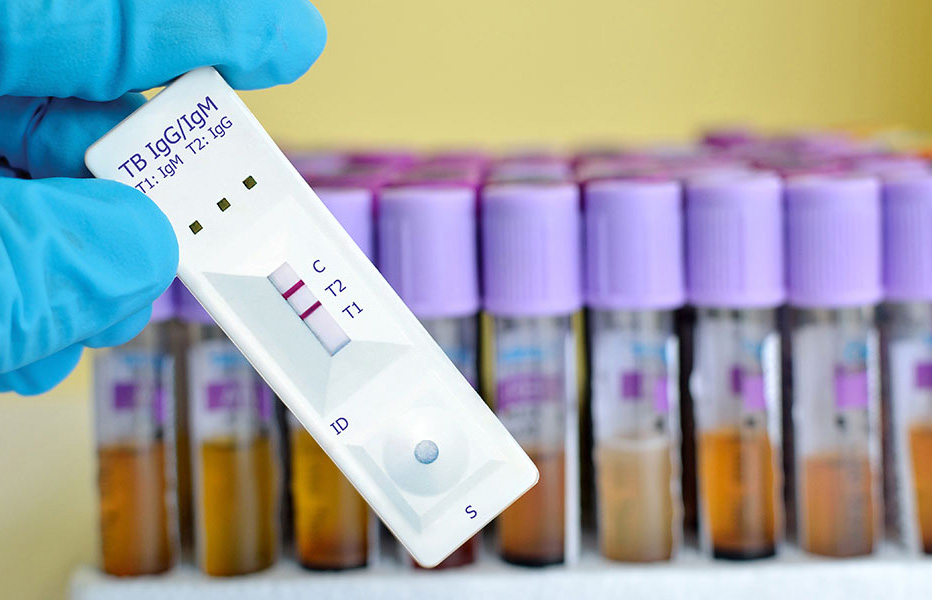

Website

Biopharmaceutical Company Official Website Development Case Study: From Internally Built Site to Branded Official Website

Rebuild the brand official website for a tropical infectious disease diagnostic products company: restructure the content architecture, add a news module, group products into domestic and international lines, apply responsive layout and brand orange color scheme throughout the site, designed and developed by the HOLYPro team.

北京健乃喜生物制药 Beijing 2026-10-11 上线
Biopharmaceutical Company Official Website Development Case Study: From Internally Built Site to Branded Official Website
客户北京健乃喜生物制药
行业与特点WebsiteLifestyle
地区Beijing
上线时间2026-10-11
交付团队XiXi
访问案例

Project Background

Beijing Jiannaixi Biotechnology Co., Ltd. is a high-tech enterprise specializing in diagnostic products for tropical infectious diseases, with business covering product development, production, and sales.

The original website was built in-house by the client's own staff, but it gradually became strained as the business grew: content layouts lacked unified standards, news updates had long been missing, and page titles and descriptions were incomplete, which was not conducive to search engine indexing; image assets had unverified copyright and unoptimized sizes, causing slow page loading. We took on the redesign and construction of the official website.

Requirements Analysis

At the business level, the client wanted to reorganize the website's content structure: clearly separate the brand, technology, services, and product lines, remove superfluous decorative elements, and enable visitors to find the content they care about through the shortest possible path.

Functionally, there were two clear requirements: first, add a news module so that users and partners can learn about brand developments at the earliest opportunity; second, divide products into two lines, "Domestic Products" and "International Products," to intuitively and quickly guide visitors from different market orientations.

Design strategy

Responsive Layout: The entire site has been switched to a responsive structure, so desktops, laptops, tablets, and mobile phones display consistent content and experience, and search indexing remains unified across all devices.

Brand Color Scheme: It uses the orange-yellow palette of the brand LOGO and extends it across the entire site, unifying the online and offline image. This is the most cost-effective way to accumulate brand assets.

Layout Standards: Typography rules are redefined by content type, with clear specifications for image-text spacing, heading hierarchy, and card width, ensuring that future content updates by the operations team remain consistent.

Brand Color Scheme

Finished Product Presentation

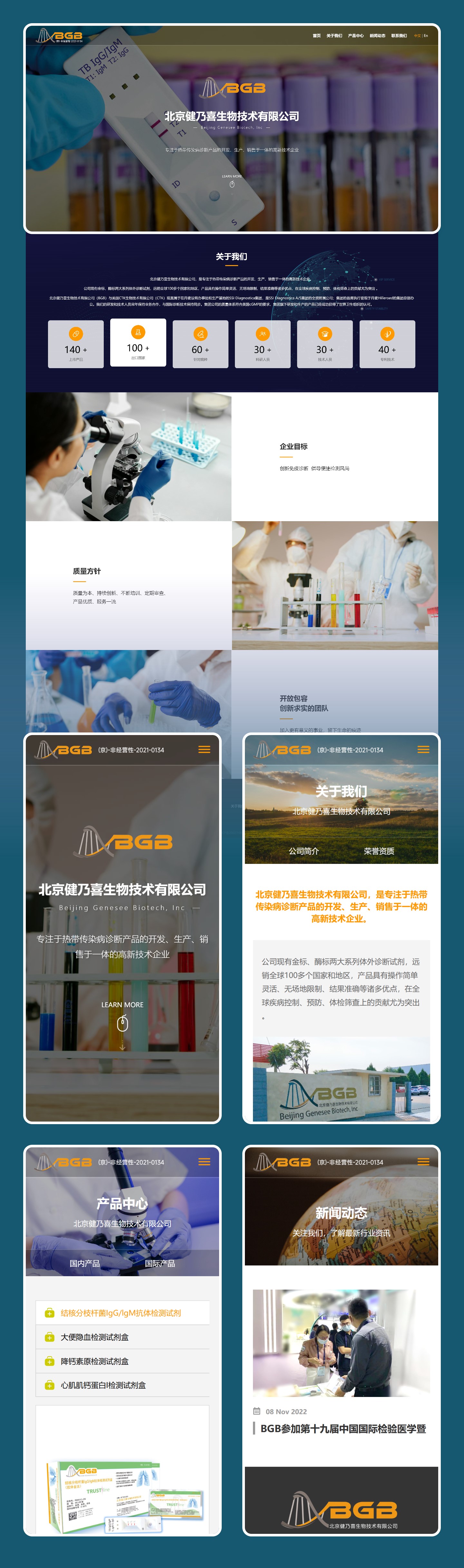
The homepage opens with a real-life view of the laboratory and the brand identity, making the company introduction and product entry points clear at a glance; the product section is neatly grouped into two product lines, domestic and international, while the news module provides a stable publishing spot for brand updates.

Full-page website design

Our observations

A biopharmaceutical company's official website must serve partners, channel distributors, and professional visitors all at once, and content structure matters more than visual gimmicks: product lines clearly separated, a fixed slot for news updates, and complete basic information — professional readers will naturally be willing to stay longer.

Another takeaway is that responsive layout isn't only about user experience — for companies like these that rely on search engines to bring in partnership leads, a consistent indexing status across all devices is itself a long-term asset.