
How the “heavy” in heavy industry is designed to be “light”: A construction record of NorStark’s axle housing foreign trade official website

A Changchun-based manufacturer of integrated cast axle housings for heavy trucks is building an English-language website for European and American OEMs. Websites for companies like this are usually packed with specifications and certificates, but this time we chose an orange-and-black contrast color scheme and product titles that speak, making heavy industry look credible, modern, and confident.

NorStark 威创机电 Changchun 2026-10-14 上线
How the “heavy” in heavy industry is designed to be “light”: A construction record of NorStark’s axle housing foreign trade official website
客户NorStark 威创机电
行业与特点MachineryCross-border
地区Changchun
上线时间2026-10-14
交付团队花里云花里云

A tough problem to tackle

Let's start with what problem we're solving this time.

NorStark (Weichuang Electromechanical) is a heavy-duty truck parts manufacturer based in Changchun, founded in 2007 and focused on integrated cast axle housings and chassis system components. Its customers are not ordinary consumers but commercial vehicle OEMs around the world — 26 OEMs, with products covering China, Europe, and North America.

This means the website has to speak to two kinds of readers: one is procurement staff and engineers, who look at specs, certifications, and capacity; the other is decision-makers, who care about whether this supplier is worth a long-term partnership.

A heavy-industry manufacturer's website usually takes one of two approaches. One is the "product catalog" style — filling pages with model numbers, specs, and drawings: professional but cold. The other is the "brochure" style — adjectives and slogans everywhere: lively but empty. Neither works well: the first is forgettable, the second is hard to trust.

What we set out to do is a third path — making a heavyweight, high-barrier, purely rational industrial product come across as credible and modern on the page, without losing warmth.
The first decision: use orange to give heavy industry a touch of "brightness"

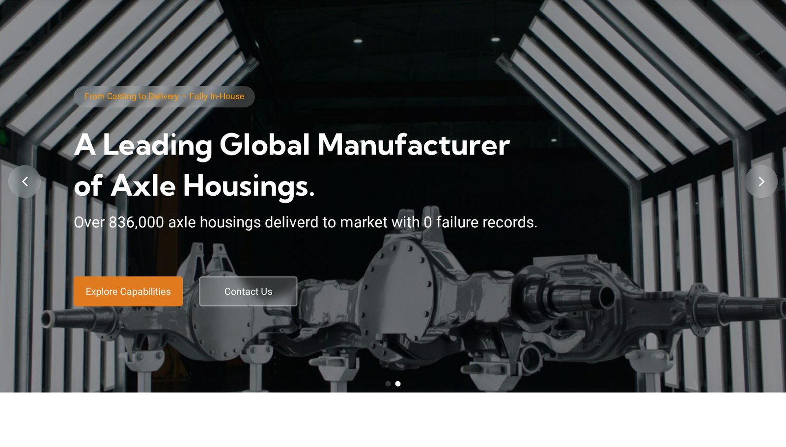
NorStark homepage hero design

The default color scheme for heavy industry websites is dark gray, dark blue, metallic silver—safe, but so safe that it leaves no memorable impression at all. Look at ten competitor websites and eight of them look more or less the same.

We chose a scheme of a deep charcoal black base with bright orange accents.

Black isn't there to feel oppressive, but to recreate the sense of light on an industrial site—foundry floors, metal equipment, structures in shadow are inherently this kind of deep, richly textured tone. It gives the composition weight, in keeping with the physical nature of these products.

Orange, then, is the key to breaking that heaviness. It is used with restraint in three places: the brand mark, action buttons, and data labels. The “Explore Capabilities” button in the hero section, the category tags on product cards, the data pills in the Why section—orange appears only where the eye needs to be "guided".

The advantage of this pairing is that the deep black communicates “we are heavy manufacturing,” while the orange communicates “we are modern and energetic.” Both messages hold true at the same time, and neither interferes with the other. Heavy industry doesn't mean outdated—that is the first idea the design wants to convey.

The second decision: make every line of copy hold up

The most common mistake in industrial goods is copy that carries no weight.

We noticed that NorStark actually held a set of highly persuasive numbers, but at first they were just "materials" scattered here and there. What design had to do was turn these numbers into language that can be remembered and spread.

Take the line on the first screen, for example — "Over 836,000 axle housings delivered to market with 0 failure records." The power of this line lies in how it turns the abstract judgment "we are reliable" into a fact concrete enough to be verified. And the phrase "0 failure" is harder than any adjective.

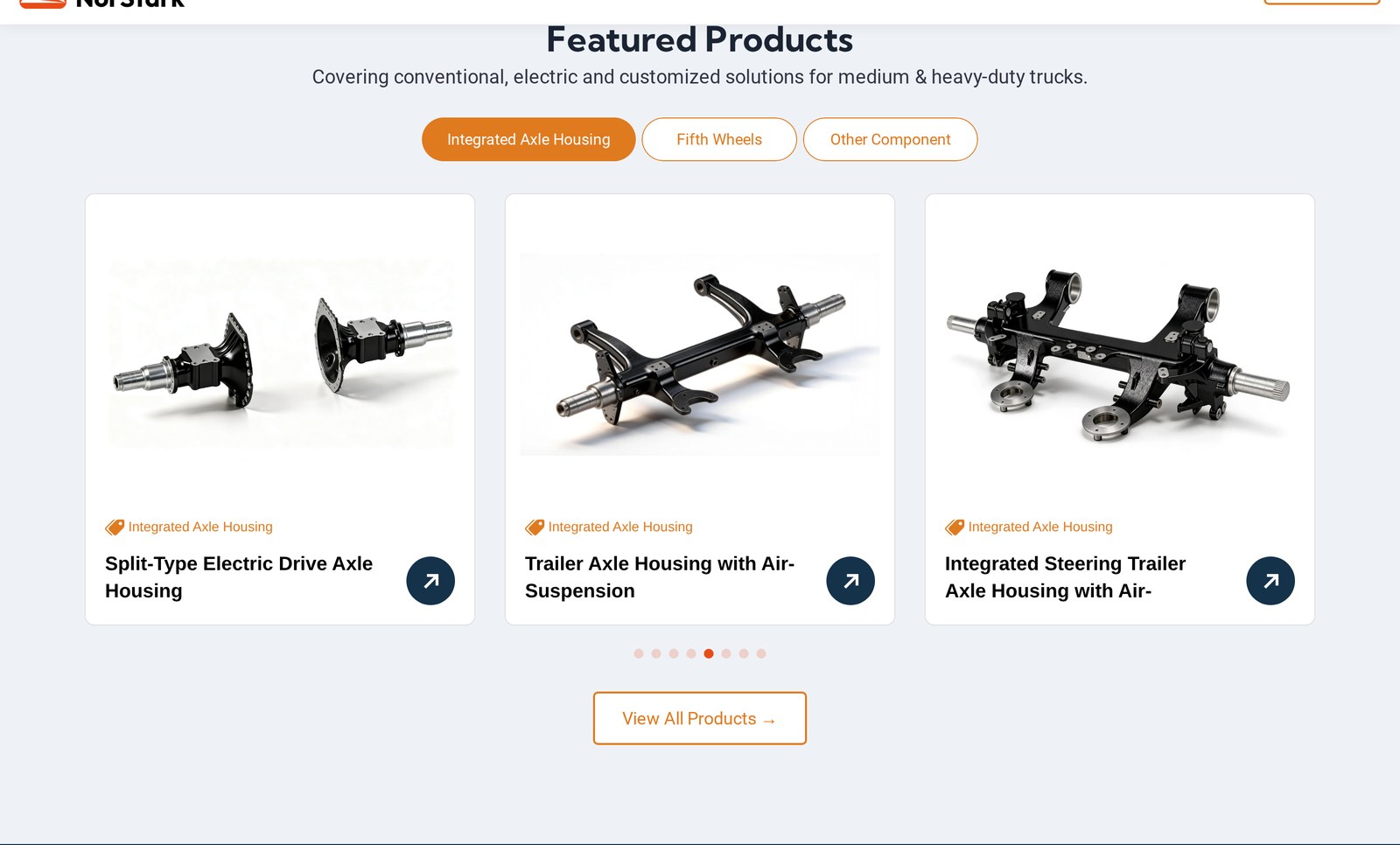
NorStark product display area design

Product titles are another example. The traditional approach is "Model XX integrated axle housing" — dry and bland. We turned them into short sentences that "speak":

  • "10%-20% Lighter, Goodbye to Stamped-Welded Housing Faults" — 10%-20% lighter, saying goodbye to the old problems of stamped-welded axle housings
  • "An Axle Housing Born for Electric Drive" — an axle housing born for electric drive
  • "One Part Replaces a Whole Row of Bolts" — one part replaces an entire row of bolts

With this change, customers can glance at a product card and immediately know what the product's value proposition is, without having to click in and read the specs. Overseas buyers and technical staff have precious little time, so being able to grasp the key point in one second is a huge plus for the experience.

The third decision: making "trust" a visible structure

For suppliers targeting OEMs, trust is the prerequisite for closing a deal. But trust isn't built by shouting "we're reliable"—it has to be built through structure.

We designed three trust pathways on the homepage:

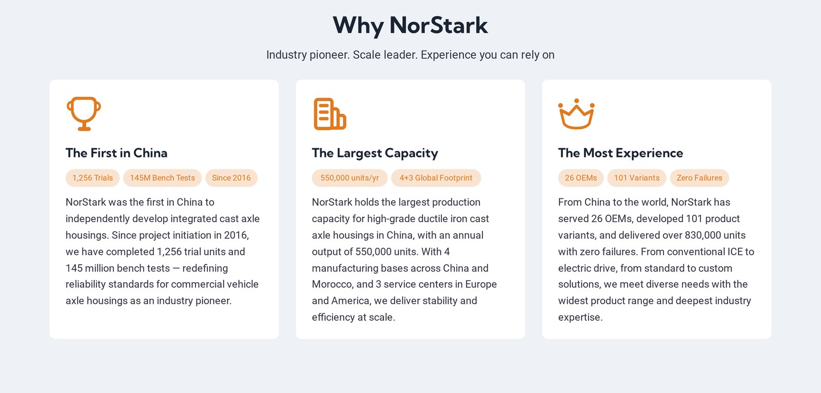
The first is visualizing our strength. The "Why NorStark" section uses three cards to answer the three most critical doubts—are you a pioneer? Is your capacity sufficient? Do you have enough experience? These correspond respectively to "The First in China" (1,256 trial production runs, 145 million bench tests), "The Largest Capacity" (550,000 units annual output, 4+3 global layout), and "The Most Experience" (26 OEMs, 101 variants, zero failures). Each card is backed by data labels, turning abstract advantages into quantifiable evidence.

Three trust cards in the Why NorStark section

The second is partner endorsement. The "Trusted by Leading OEMs Worldwide" section displays logos of global automakers—for suppliers, the choices of peers are the most powerful proof.

The third is system compliance. Four certifications—IATF16949, ISO14001, ISO45001, and ISO9001—are presented directly in the services section. For European and American customers, these certifications are a hard threshold for "whether you can even enter the procurement list," and they must be visible at the first-screen level.

Combined, these three pathways form a complete trust structure of "self-proof + third-party proof + certification." After browsing through, customers' rational doubts are largely dissolved.

One more point: it talks about the present as well as the future.

Official websites of heavy industry companies easily give off a “sense of the past”—as if they are all about historical accumulation. But on NorStark’s official website, we deliberately set aside two sections: “Innovation” and “Sustainability.”

They include a roadmap for “achieving carbon-neutral operations by 2035,” a plan for a Moroccan manufacturing base to begin production in 2027, and forward-looking directions such as hydrogen pyrolysis reactors for hydrogen production.

The intention behind this is: to let customers see not only “what this factory has done in the past,” but also “where this factory is headed.” For OEMs that require long-term cooperation, a supplier’s future plans need to align with their own strategic rhythm. Showing the future is, in essence, also showing “we are worth betting on.”

Building an industrial website is, at its core, about "propriety."

Looking back at this project, the biggest challenge wasn't actually the visuals—it was a sense of proportion.

If a heavy industry website is too plain, it looks cheap; too flashy, and it seems unprofessional. Too little copy, and you can't show your strength; pile on too much, and it reads like a compilation of materials. Use too little orange, and there's no memorable hook; use too much, and it looks like a consumer goods site.

Every design decision was about finding the balance point between these tensions. Our approach was this—leave the "weight" to the content, and the "lightness" to the interaction; leave the "rationality" to the data, and the "warmth" to the narrative.

In the final website we present, we wanted it to have both the solidity and credibility of an industrial product and the smoothness and comfort of a modern website. For a Chinese manufacturing company going global and dealing with OEMs around the world, a website that explains things clearly, looks comfortable, and inspires trust is itself a form of competitiveness.

This is also what we have always insisted on in enterprise digital services: A website isn't just a face turned outward—it's the first basis on which customers judge you.