
Website

Designing an official website for a ship repair company: How should the section structure be arranged so that shipowners worldwide can quickly find answers?

Ship repair is an industry where urgency comes first—ships cannot wait, and customers usually visit a website with clear questions: Can you repair it, how soon can you get there, and do you have the qualifications? This time, we designed a website for a marine thermal energy engineering company in Shanghai, focusing mainly on the arrangement of the section structure: enabling every type of visitor to find their answer within three steps.

堡曼热能工程 Shanghai 2026-10-15 上线Launched 2026-10-15
Designing an official website for a ship repair company: How should the section structure be arranged so that shipowners worldwide can quickly find answers?Designing an official website for a ship repair company: How should the section structure be arranged so that shipowners worldwide can quickly find answers?Designing an official website for a ship repair company: How should the section structure be arranged so that shipowners worldwide can quickly find answers?Designing an official website for a ship repair company: How should the section structure be arranged so that shipowners worldwide can quickly find answers?Designing an official website for a ship repair company: How should the section structure be arranged so that shipowners worldwide can quickly find answers?
客户Client堡曼热能工程
行业与特点Industry & TraitsWebsiteMachineryConstruction
地区RegionShanghai
上线时间Launched2026-10-15

In this industry, the top priority of an official website is to "catch urgent matters."

Let's start with the characteristics of this industry. Ship repair is not quite the same as general manufacturing services — it is a classic dual-track business of "emergency + planned". When a ship is at sea, a broken piece of equipment cannot wait: the boiler won't ignite, the IGG inert gas system alarms, the incinerator lining burns through — all of these directly determine whether the vessel can set sail. Clients' visits carry obvious urgency; when they land on the official website, they are usually not there to "get to know" you, but to ask "can you fix it, how soon can you get there, and do you have classification society approval".

So in this project, we put the focus of the design on a link that is usually the easiest to overlook — the arrangement of the section structure. Visuals are only the first impression; what really decides whether this website can retain clients is the information architecture: visitors come in with questions — can they follow the shortest path to the answers?

Section organization: organize by customer problems, not by company departments.

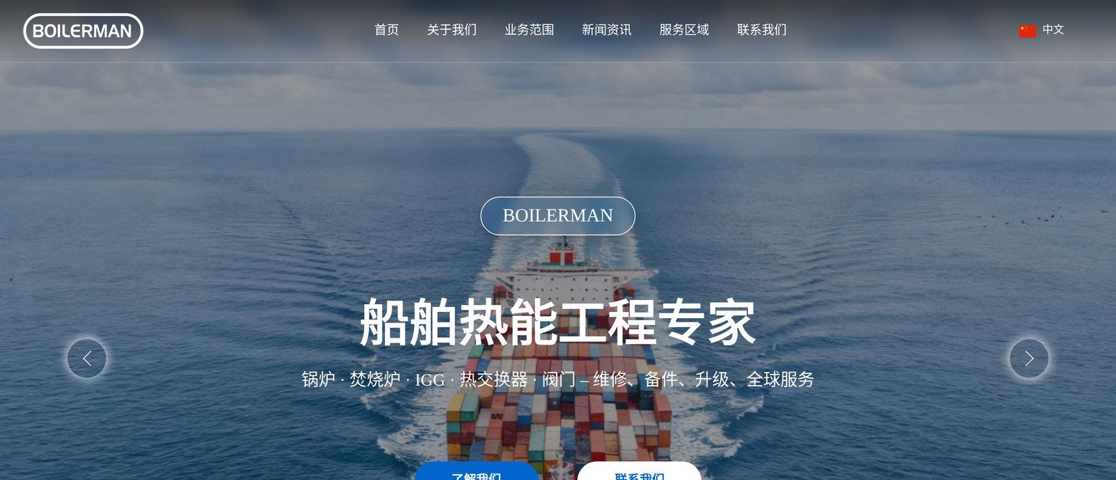
Homepage hero: navigation and main visual

Many corporate website sections are grown out of the company’s internal structure—Company Profile, Corporate Culture, Organizational Structure, News Center. This structure is very convenient for the company itself, but not for customers: customers do not care how your departments are divided; they care about “which part of your business handles my problem.”

For this website’s navigation, we reclassified everything by business scenario. There are only six top-level sections: Home, About Us, Business Scope, News & Insights, Service Areas, Contact Us—each one corresponds to a specific action a visitor wants to take, and none of them exists just to “put some content.”

The key move is in “Business Scope.” This company’s service lines are actually very broad: boiler repair, incinerators, inert gas system (IGG), heat exchangers, valves, spare parts, and automation. If laid out as one long list, visitors would have to figure out for themselves which one matches their equipment. We split it into five independent service channels—Inert Gas System Services, Incinerator Repair, LNG Carrier Main Boiler, Boiler Repair, Boiler Spare Parts and Automation Services—each with its own page, and each complete with its own service content, typical cases, and contact details. Customers enter from the starting point of their own equipment, and what they see is “cases and solutions similar to my problem,” without having to find the intersection themselves across ten pages.

Homepage information hierarchy: within three screens, make the case for why you can be trusted.

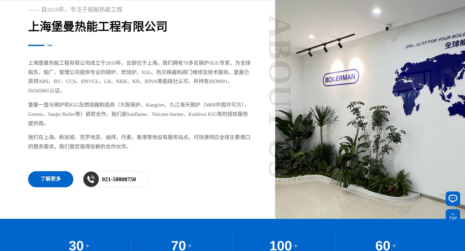
About Us section: company introduction and data band

For the homepage layout, we set a standard for ourselves: a visitor should be able to answer “Is this company any good?” without scrolling past three screens.

The first screen answers “What do you do?” The hero visual uses a container ship underway, paired with the positioning line “Ship Thermal Energy Engineering Experts,” and the subtitle lists the service targets all at once—boilers, incinerators, IGG, heat exchangers, valves, plus repair, spare parts, upgrades, and global service. One sentence says both “what we do” and “how we serve,” leaving no suspense.

The second screen answers “Are you qualified enough?” In the About Us section, the key facts—founded in 2010, more than 70 experts, recognized by 8 classification societies (ABS, BV, CCS, DNVGL, LR, NKK, KR, RINA)—are placed at the first-screen level, followed immediately by a data band: countries served, professional engineers, global partners, honors and qualifications, four numbers you can scan at a glance. For shipowners, classification society approval is a hard threshold, and this screen completes the qualification check.

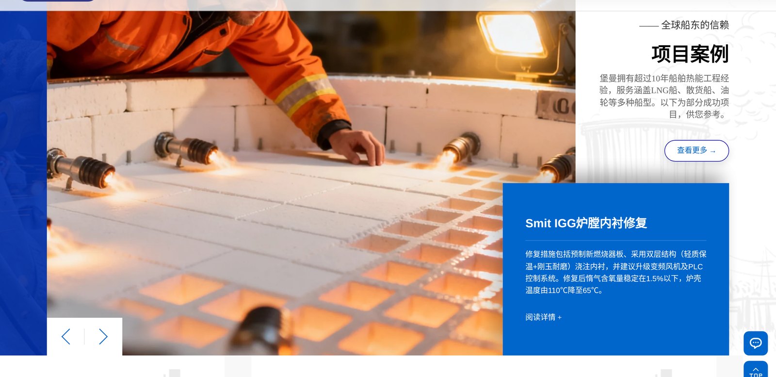
The third screen answers “What have you done?” The engineering case section goes straight to real repair scenarios—Smit IGG furnace lining repair, Kangrim boiler tube insertion, Aalborg burner retrofit—each case paired with an on-site photo and a process description. We deliberately did not turn the case section into an “image wall”; instead, we kept the full narrative of technical details, because the people reading this are technical superintendents and chief engineers. What they want is not good looks, but “you have actually done this job.”

Two easily overlooked detail designs

Engineering case studies section: on-site photos and technical descriptions

Beyond the overall structure, two details are worth mentioning separately.

First, "Service Areas" stands as its own column. The company has service locations in Shanghai, Singapore, Croatia, Dubai, Denmark, and Hong Kong—for the marine industry, this set of information is no less valuable than the products themselves, because "how close it is to the port" directly determines emergency response speed. Most companies bury their branch information in "About Us"; we pulled it out and made it a standalone column, which is essentially telling shipowners directly: wherever your ship sails, our service goes.

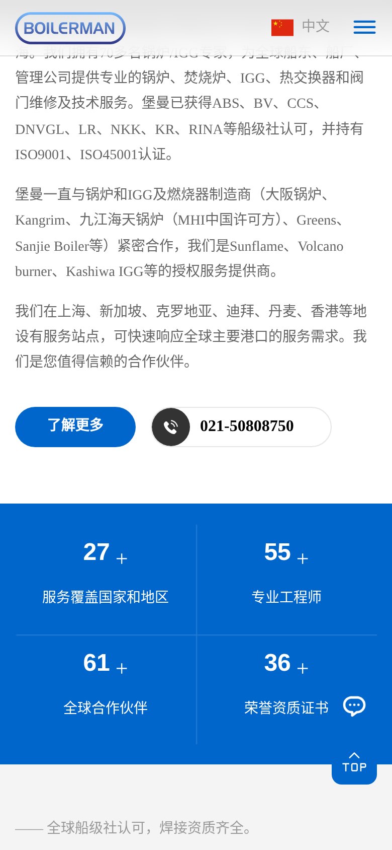
Second, reading adaptation for mobile. Many customers in the marine industry view things on board—in the engine room, between shifts—where the phone is the primary device. For mobile, we didn't do a simple scaling adaptation; instead, we rearranged the information hierarchy: the data strip became a four-cell grid, case descriptions collapse and expand, and the phone button is always present. On narrow screens, the cost of the action "find the phone number" is reduced to a minimum.

Mobile adaptation: information rearrangement on narrow screens

A trade-off in content arrangement

There was also a trade-off in this project that we discussed internally, and it's worth noting down.

In the news section, the client provided several technical articles—superheater tube failure analysis, key points for IGG furnace repairs. This content is professional and solid, but it isn't "news"—it's more like technical notes. Should it go under "News & Updates"?

We ultimately decided to include it, and to place it prominently. The reason: for shipowners and technical managers, the best proof that "this company knows its technical stuff" is the technical articles it writes itself. Anyone can post company news (opened another site, got another certificate), but explaining the three failure modes of boiler superheater tubes clearly is something only people who have actually done the work can write. This kind of content is the most valuable trust-building material a repair service provider can have.

In conclusion

Having completed this case, our deepest takeaway is: for a service-oriented company's website, the core work of design lies in "orchestration," not "decoration."

Clients arrive with specific questions, and the website's job is to let them find answers along the shortest possible path while building trust in the process — where to see qualifications, where to verify case studies, where to make the call; every step is designed.

What we delivered for Baoman Thermal Energy Engineering this time is exactly such a website, one that orchestrates "emergency repairs findable, qualifications visible, strength trustworthy" into its column structure. The URL is in the case source — you're welcome to click through and see the actual results.