
Website

Industrial equipment official website: turning parameters from incomprehensible to comparable

A set of precision measurement equipment installed on a production line; the buyer is an engineer, not the boss. The design challenge for this kind of official website is not visual—it is moving parameters from incomprehensible to comparable: three decisions—how the entry points branch, how parameters are compared, and at what point the evidence is placed.

希普韦尔 Shapwell Qinhuangdao Launched 2026-10-19
Industrial equipment official website: turning parameters from incomprehensible to comparable
Client希普韦尔 Shapwell
Industry & TraitsWebsiteMachinery
RegionQinhuangdao
Launched2026-10-19
Delivery TeamChenChen

The readers of this kind of website are engineers, not bosses.

A set of precision measurement and closed-loop control equipment installed on the production line, with a high unit price and a long decision chain: the equipment department cares about whether it can be installed, the process department cares about whether it is accurate, and procurement cares about how much it costs and how long delivery takes. A proposal has to be passed three times among the three departments.

Therefore, the primary reader of this type of official website is the engineer. When he opens the page, he has only five questions in mind: how much precision, how fast the response, whether it can withstand high temperature, high humidity, and strong magnetism, who will repair it if it breaks, and whether old equipment can be retrofitted.

The design goal is therefore very specific: to let him complete a technical judgment within three minutes. Not to make him remember the brand, but to enable him to take this page to a meeting.
q1.jpg

On the first screen, branch first, then introduce.

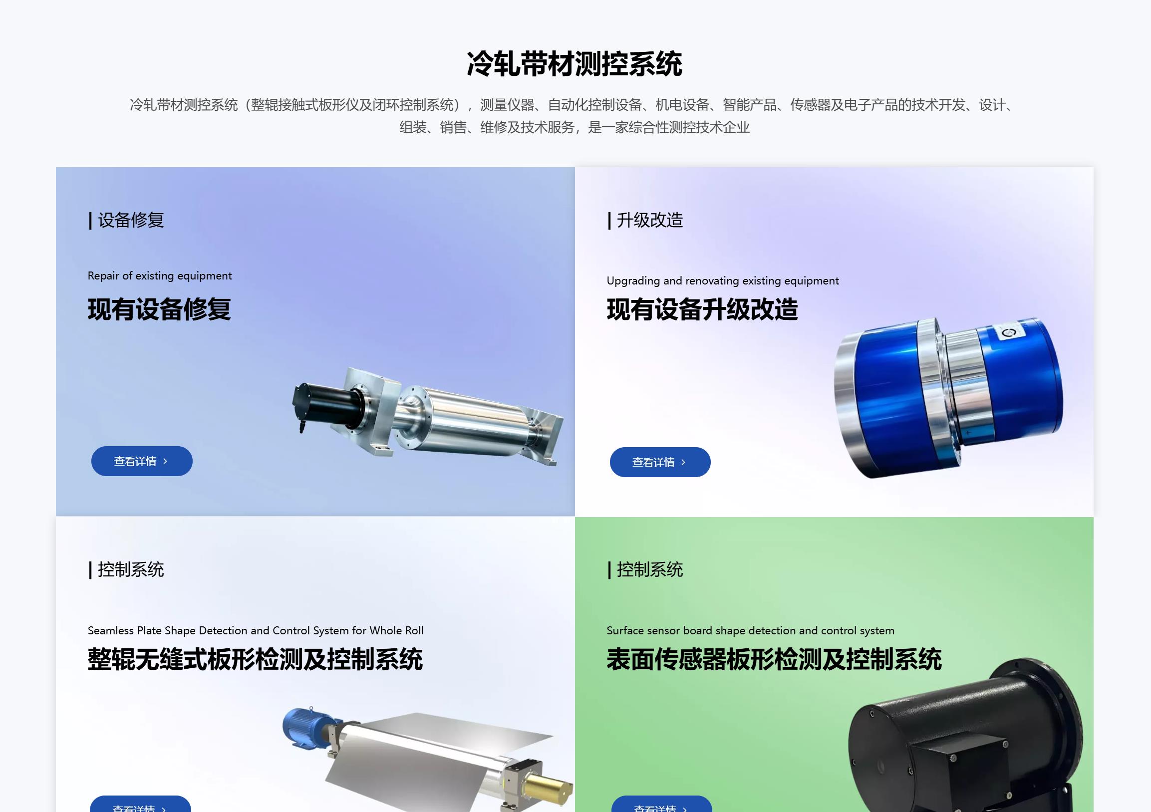
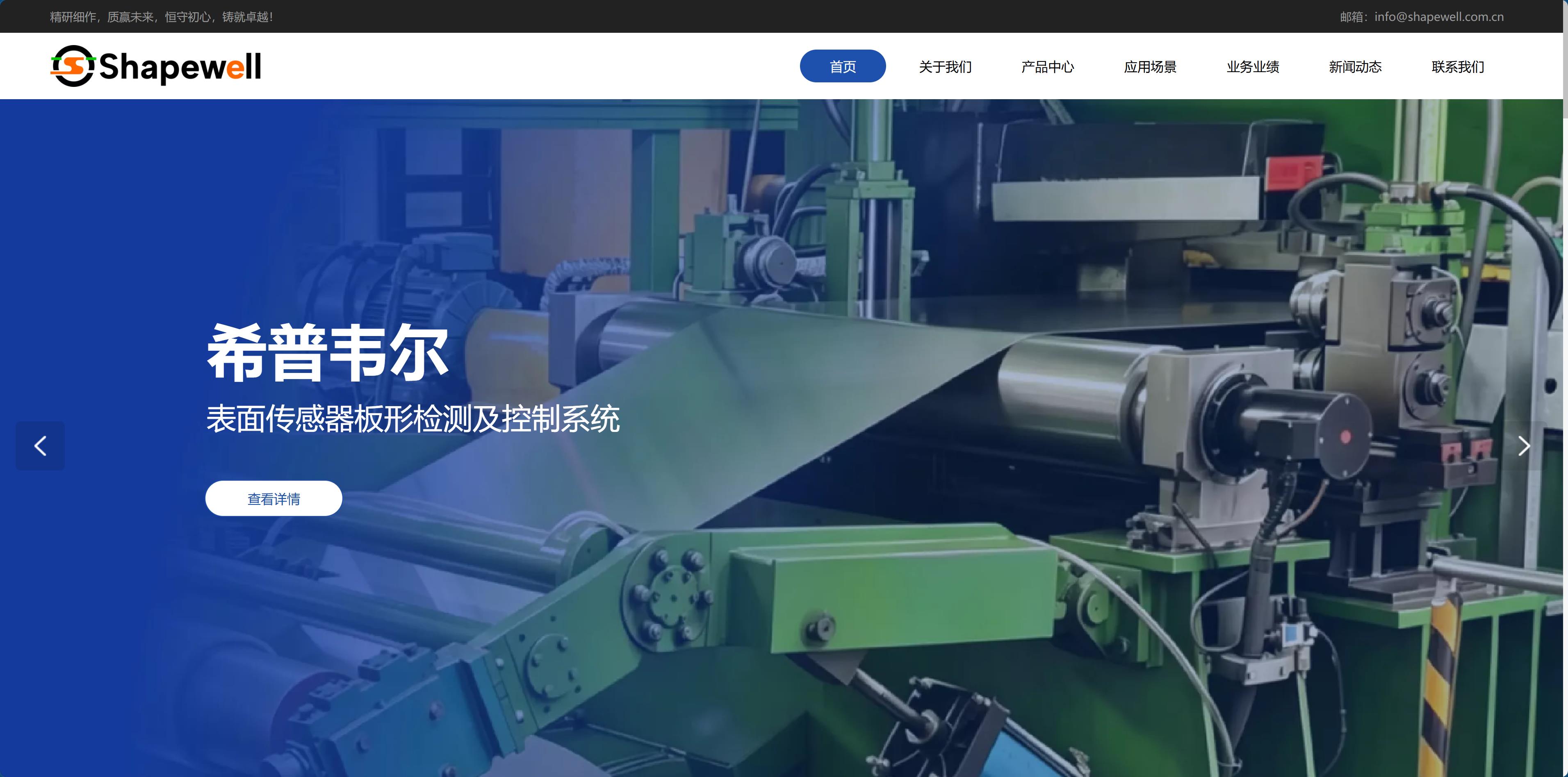
The first screen does only two things: state in one sentence what equipment you make and which production line problem it solves; then split the entry points into three—

Buy a complete new system / Repair existing equipment / Upgrade and retrofit old lines.

This is the most important information architecture decision for the entire site: the basis for branching is not "our product lines" but "the visitor's situation."

The same visitor may have equipment that is simply broken and is in a hurry to find a repair. If the homepage first directs him to product manuals, he will most likely leave and look for the next company.The same content, arranged once by situation, will produce a different conversion rate.

q2.jpg

Parameters are not a list but a comparison.

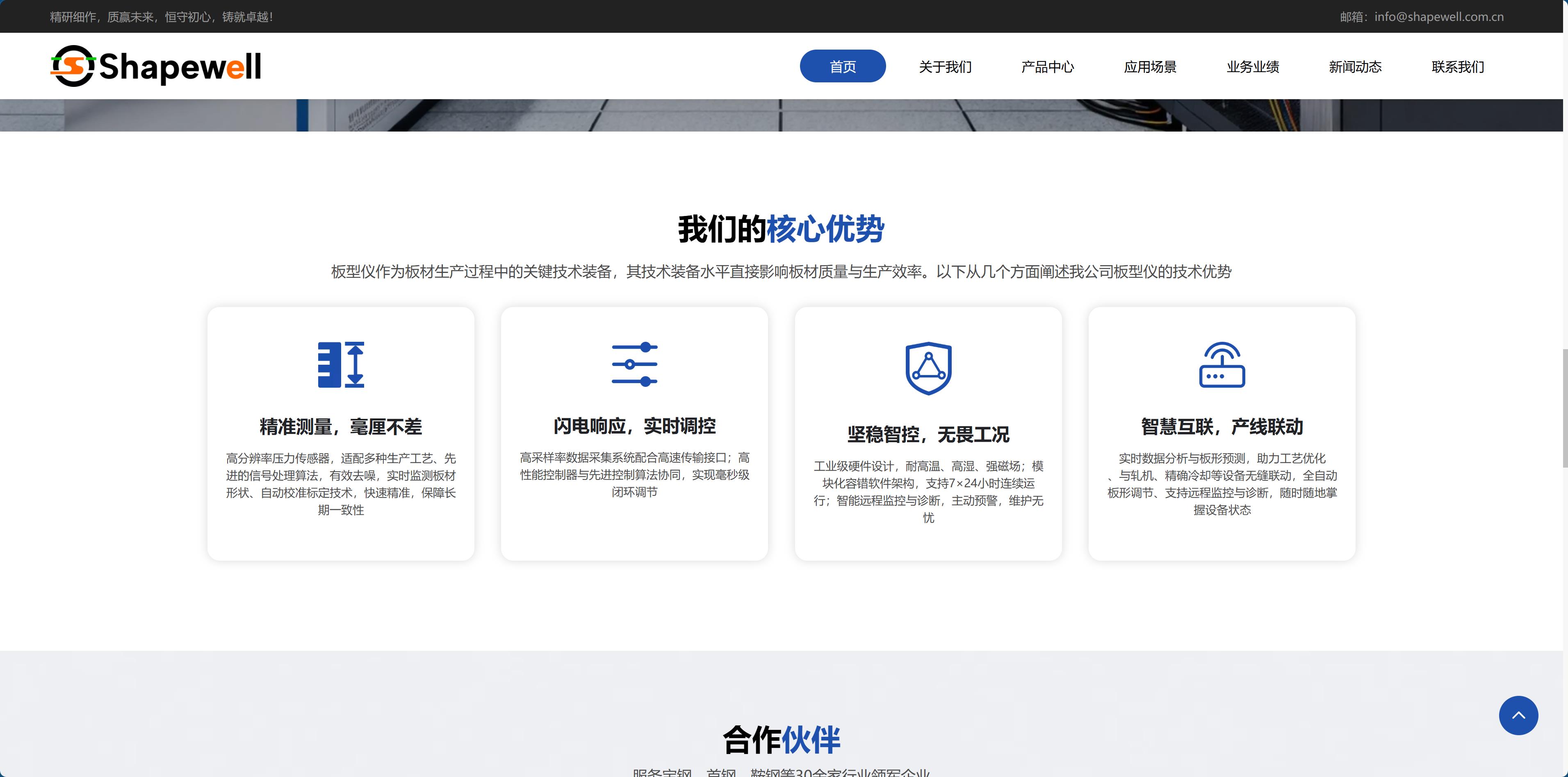
The specifications of industrial equipment are most easily written as a dense, crowded table. We have condensed the capabilities into four groups, each built as “capability + consequence”:

  • Precision measurement—high-resolution sensing, signal denoising, automatic calibration, all translating into “long-term consistency”
  • Fast response—high sampling rate, high-speed interfaces, millisecond-level closed-loop regulation
  • Stable operation—withstands high temperature, high humidity, and strong magnetic fields, 7×24 continuous operation, modular fault tolerance
  • Linked operation—collaboration with rolling mills, cooling equipment, and other devices, with support for remote monitoring and diagnostics

The key is not how many items are listed, but that each one gives a point of comparison with other vendors. Engineers do not look at “excellent performance”; they look at how much precision can be achieved, how many milliseconds the response takes, and whether it can run continuously.

There is also the language layer: after a Chinese claim, a line of English technical phrases creates visual hierarchy. English here is not translation; it is giving the page rhythm—the eyes land first on the Chinese judgment, then are carried along for a line by the English.

q3.jpg

Evidence should be placed at the very moment when the question arises.

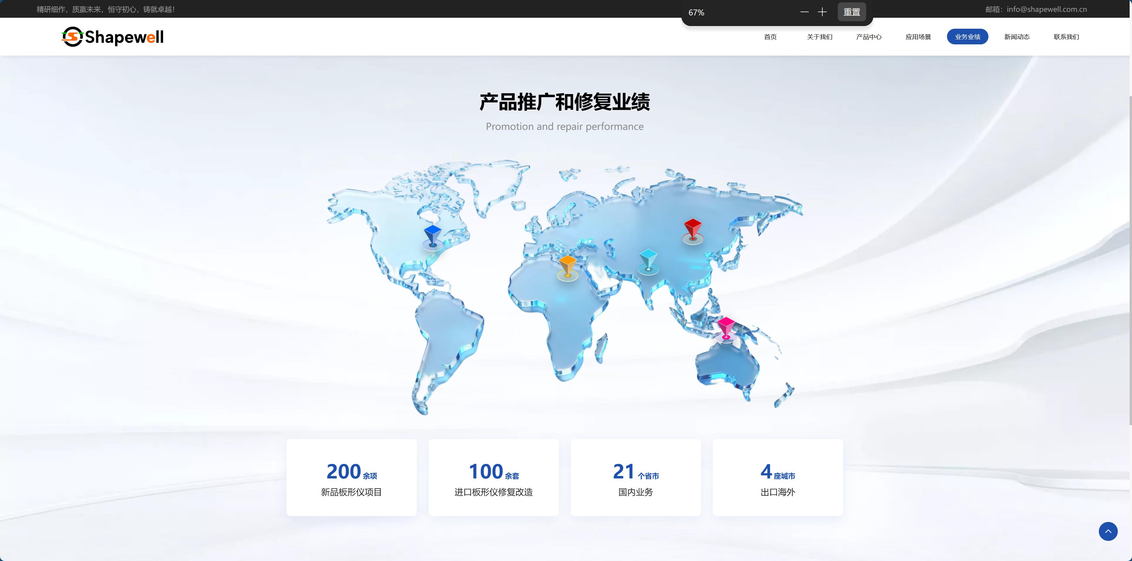
The evidence for this type of company is usually solid: it has served leading companies in the industry, completed more than 200 projects in total, repaired over 100 sets of imported equipment, and owns a 6,000-square-meter workshop with more than 60 processing machines, plus a number of patents and qualifications.

But where the evidence goes matters more than how much of it there is.

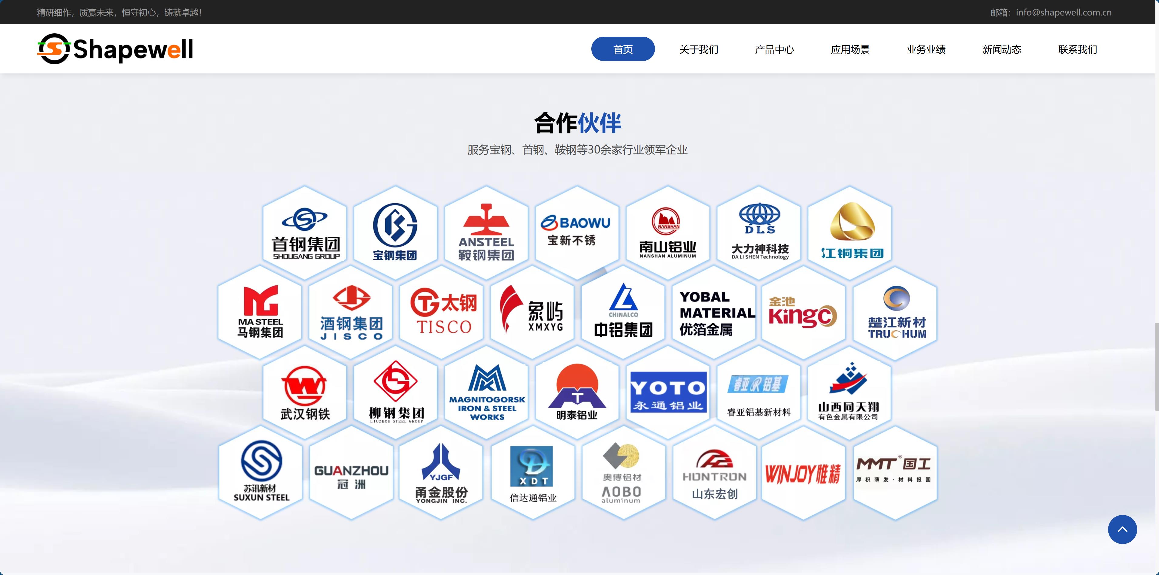
The client list goes under "Who We Serve" — answering "Are you qualified enough?"; the project and repair counts go under "How Much We've Done" — answering "Are you experienced?"; the workshop area and equipment list go under "Why We Build It Ourselves" — answering "Are you just an assembly plant?"; patents and the performance map get a page of their own — left for those who need to do due diligence.

The value of evidence lies not in its quantity, but in when it appears. Dumping it all into "About Us" is as good as burying it.

q4.jpg

The Measure of Industrial Vision

The visuals for an industrial website must be restrained. Dark backgrounds, metallic textures, and equipment photos as the main focus—no glowing lines or tech particles. Those things make engineers feel you're talking concepts, not machines.

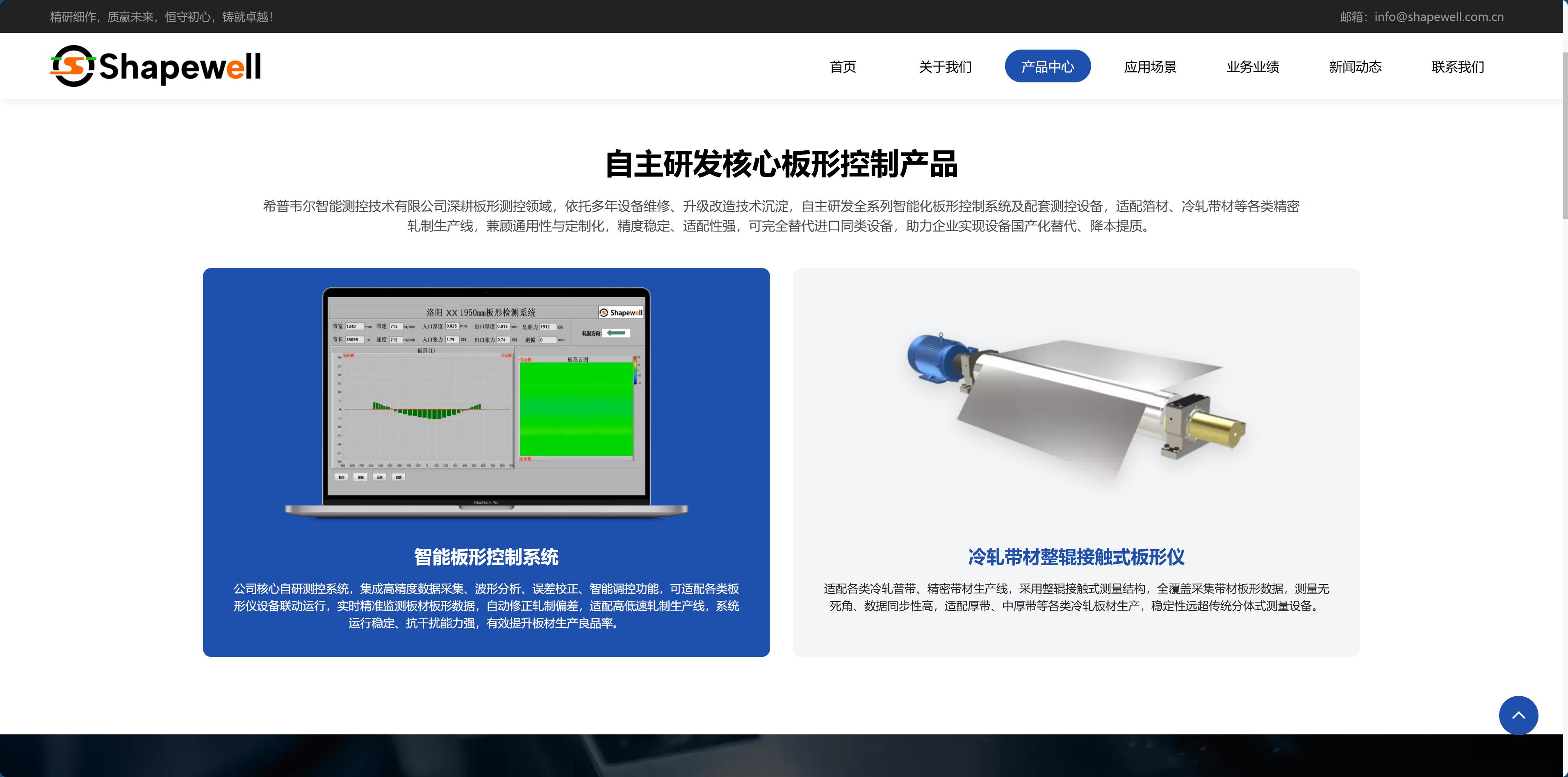
Crop all images into three types: full equipment views, close-ups of key parts, and production line installation sites. Each type serves its own purpose: the full view shows scale, the close-up shows craftsmanship, and the site photo shows credibility.

Mobile needs separate consideration. Engineers often use their phones to look up information in the workshop. On small screens, parameter tables should either be reflowed into cards or cut down to just three columns—no one in a workshop will look at a horizontally scrolling table.

Keep only name and phone number in the form. Inquiries for industrial products rely on follow-up calls, not on filling out every form field; the more fields there are, the fewer people will dare to leave their information.

q5.jpg

The three most common pitfalls of such sites

First, treating slogans as the hero section. Phrases like "Refined craftsmanship, quality wins the future" placed on the first carousel slide will make engineers scroll right past. The hero section space should be given to "what you do and what you solve."

Second, parameters lack a sense of units. Writing "high precision" without specific values, or "fast response" without milliseconds—it's as good as saying nothing.

Third, duplicate content isn't cleaned up. The same technical description appears twice on the page, pasted from different materials during editing, and no one reads through it. Visitors may not say it, but they'll remember the site as "not very rigorous."

For an industrial product's official website, persuasiveness lies entirely in the density of details. When the density is sufficient, adjectives aren't needed.

q6.jpg