
Website

Vocational Education Group official website: turning policy language into information that customers can evaluate

A vocational education technology group controlled by Haidian state-owned capital, with operations spanning three lines—digital products, consulting, and training—and also owning a research college founded in 1999. Half the readers of such a site come to scrutinize, and half come to use. The challenge is not visual; it lies in taking an entire body of policy discourse and layering it into information that institutions can directly use to make judgments.

北京华职教育科技集团有限公司 Beijing Haidian Launched 2026-10-25
Vocational Education Group official website: turning policy language into information that customers can evaluate
Client北京华职教育科技集团有限公司
Industry & TraitsWebsite
RegionBeijing Haidian
Launched2026-10-25
Delivery TeamChenChen

Half the readers of this kind of site are here to scrutinize.

Readers in the vocational education industry are a special audience: vocational colleges, education authorities, industry associations, and the HR departments of state-owned enterprises. When they open a group's official website, the first thing they usually do is not look at the design but verify — who runs it, whether it is state-owned or private, whether it has national-level programs, whether it understands "Double High," and which institutions it has partnered with.

This action is "scrutiny," not "browsing."

So the hero section cannot just talk about vision. It must deliver three things within seconds: identity, position, and credentials.

This site's approach is: a one-line proposition placed front and center — "Digital-intelligent empowerment of industry-education integration"; the line below completes the statement — driving deep integration of the education chain, talent chain, and industry chain through digital-intelligent innovation; only then come the entry buttons.

It does not explain what "industry-education integration" is, because readers in this industry all know. What they need to confirm is: are you truly part of this system?

chiheng1.jpg

Two signboards, one main line.

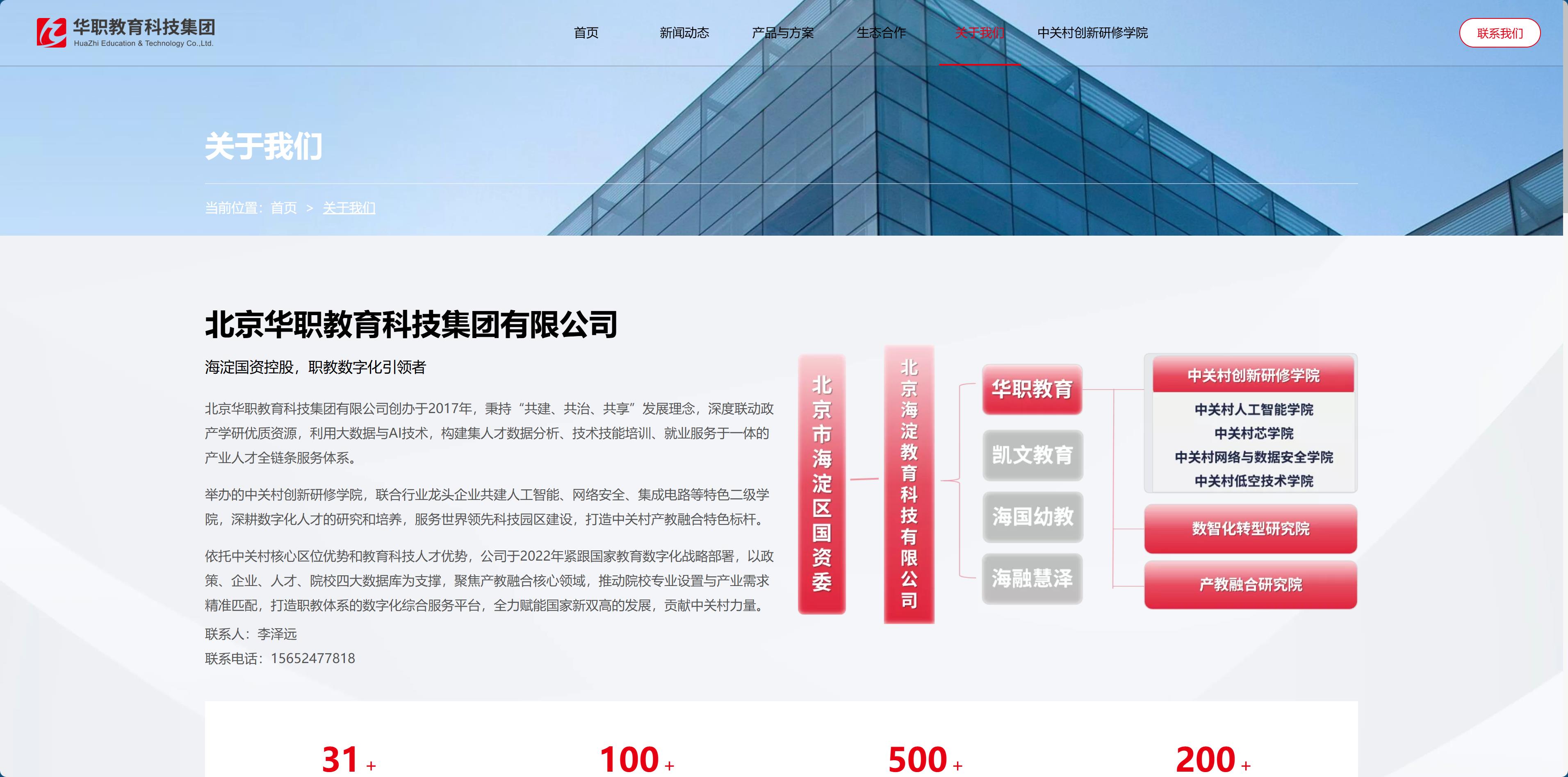
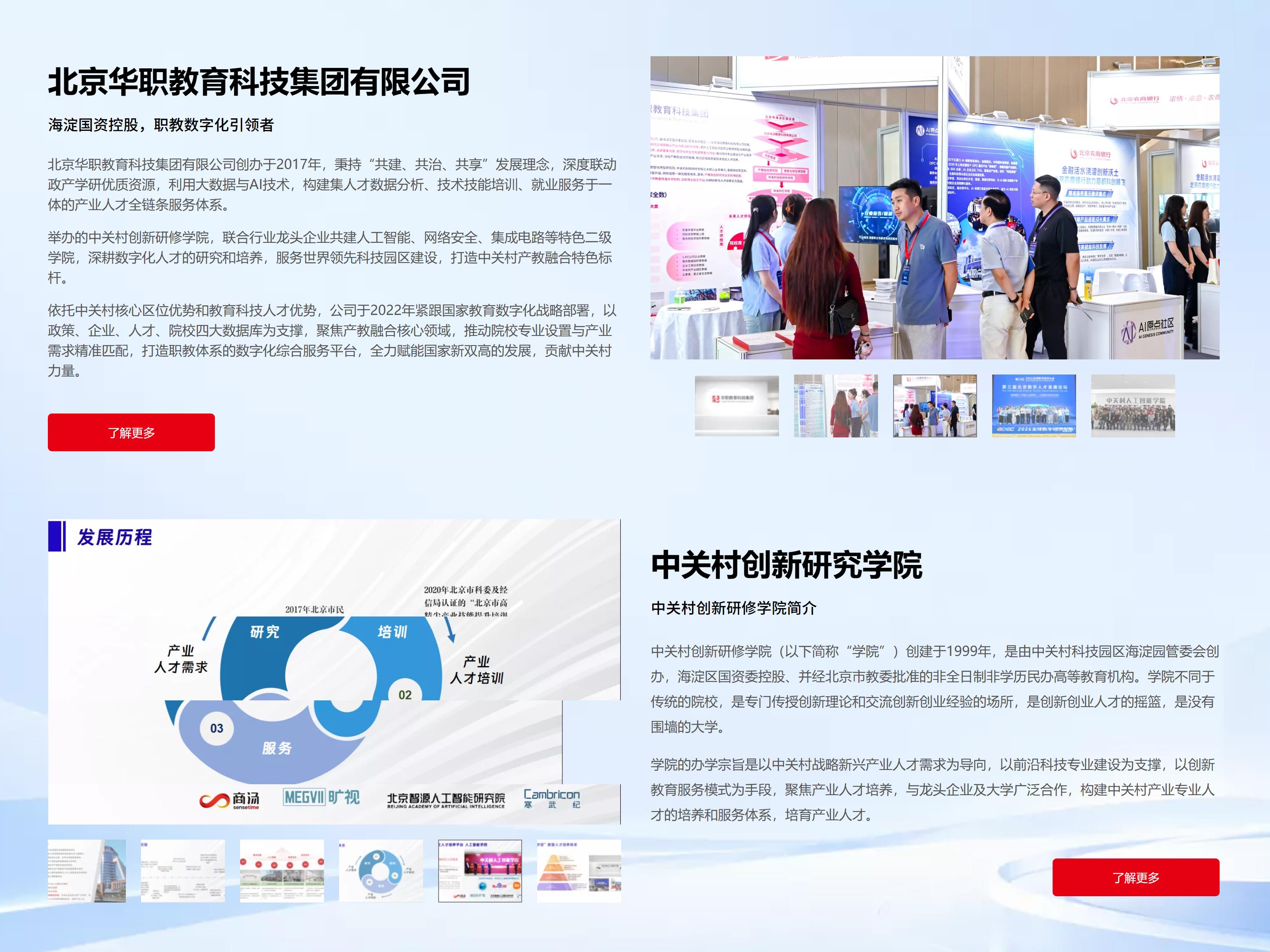
The group operates under two identities: one is the education technology group itself, and the other is a training college founded in 1999 by the park management committee and controlled by the district state-owned assets supervision commission.

The two identities have different business natures. The group provides digital products and consulting, while the college provides training and runs educational programs. When placed on one website, the most common problem is that the two lines each speak only for themselves, and visitors cannot tell whether this is one organization or two.

The solution is layering, not merging.

In the navigation, the “About Us” dropdown lists only the college; in the footer, “Digital Intelligence Products” and “Industry College” are split into two parallel columns; in the main text, the two introductions each occupy one screen and clearly explain their respective founding backgrounds and functions.

With clear subjects and clear relationships, visitors will piece together the full picture themselves—but before they can do that, they must first know that there are two entities here.

chiheng2.jpg

Navigation is organized by what customers need to accomplish, not by department.

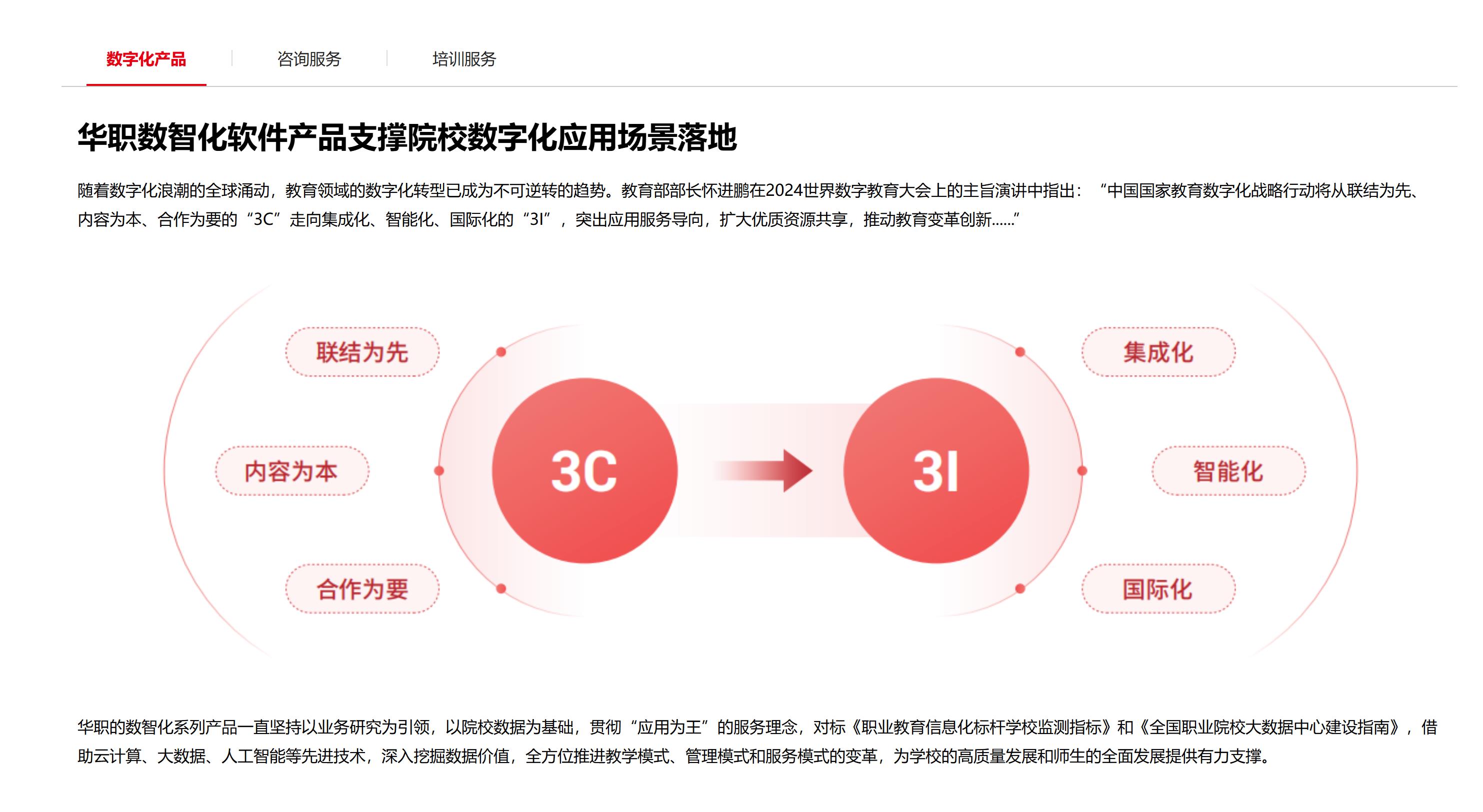
"Products & Solutions" dropdown contains only three items: Digital Products, Consulting Services, Training Services.

These three correspond not to departments, but to three deliverables: a system, a plan, and a group of people.

Most peers' navigation is "Product Center / Solutions / Service Support"—that is our organizational structure. These three, however, are the three things customers need to accomplish. When a college wants to build a new discipline cluster, it usually needs a platform, a plan, and faculty at the same time; without any one of them, it cannot move forward.

Placed under the same entry, customers do not need to guess among three sections.

This may look like just a navigation structure, but what it actually determines is the visitor's first minute: whether they can immediately judge "this company can solve my problem."

chiheng3.jpg

Evidence should be grouped, and a reference point should also be provided.

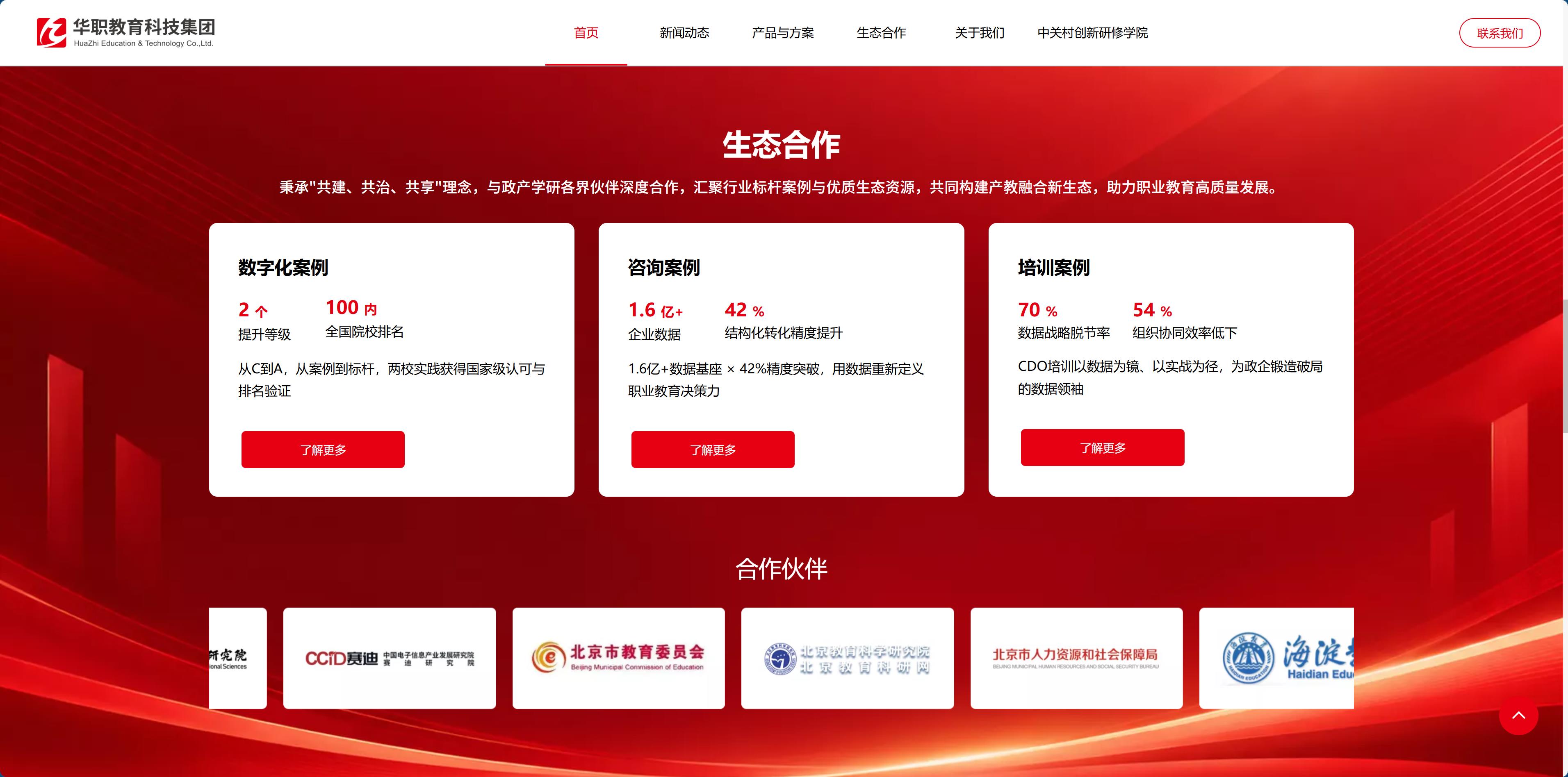
The ecosystem collaboration section has three groups: digitalization case studies, consulting case studies, and training case studies. Each group has two figures, and the figures are meant to correspond to one another.

  • Digitalization case studies: two levels of improvement / within the top 100 nationwide institutions
  • Consulting case studies: 160 million+ enterprise data foundation / 42% improvement in structured conversion accuracy
  • Training case studies: 70% data strategy disconnect rate / 54% low organizational collaboration efficiency

The first two groups are results, while the third group starts with problems. This order matters: the persuasiveness of the training business does not lie in "how well we teach," but in "how urgent your current problems are." Only after naming the industry's pain points does the course become necessary.

Numbers here are not decoration. They must answer a specific question: Have you done it, to what extent, and is it similar to my situation?

Three questions correspond to three groups of numbers, and not a single group can be omitted.

chiheng4.jpg

In this industry, news coverage is proof of capability, not a marginal afterthought.

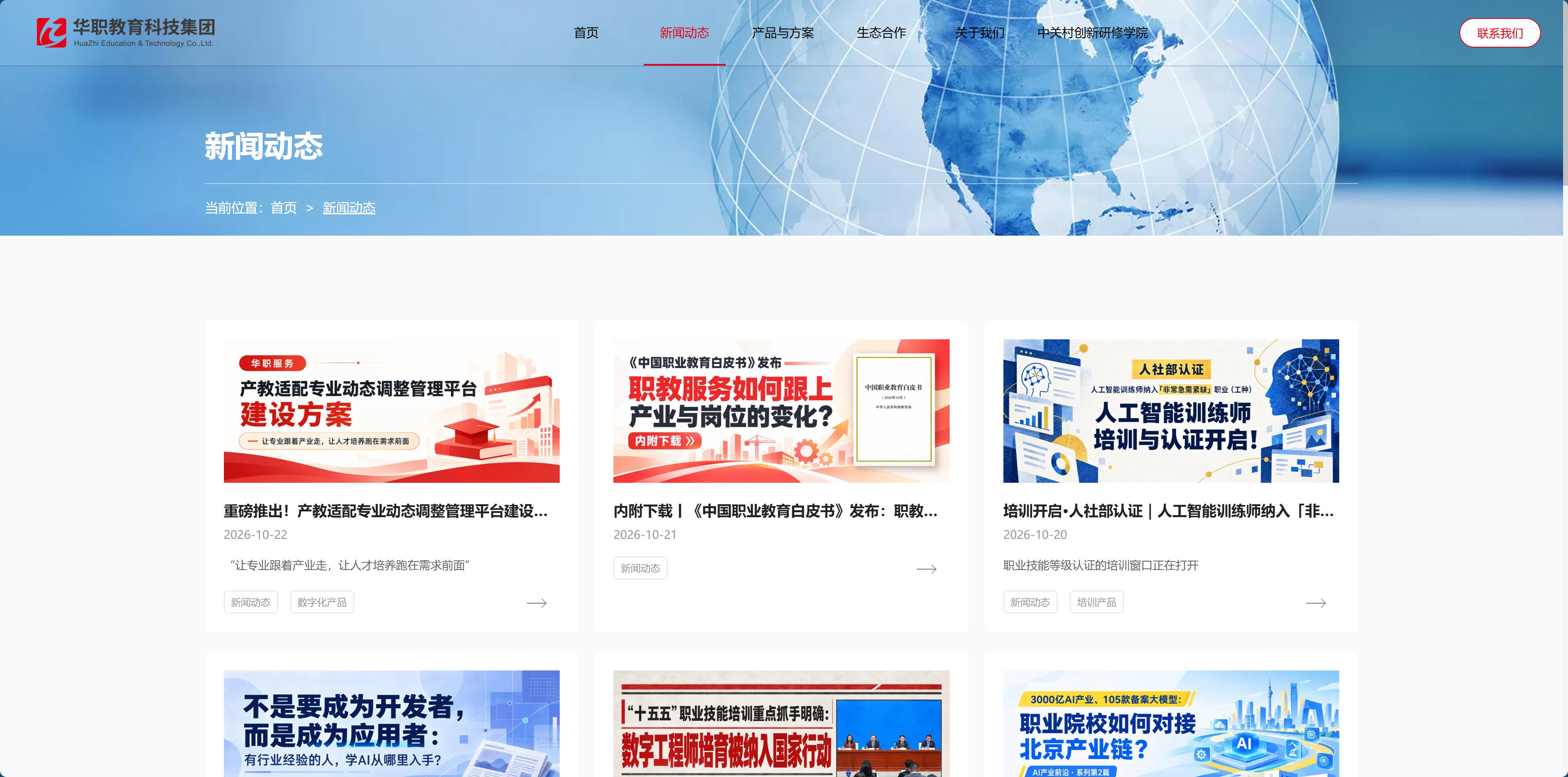
Immediately after the hero section comes the updates section, with eight entries, all linking to long-form articles: platform construction plans, white paper releases, professional certification training, and observations on new roles.

For government, enterprise, and educational institution clients, the updates themselves are proof of capability—it is following policies, developing proposals, and running educational programs. When this type of client judges whether an institution is active, they look at update frequency and whether the topics are on point.

In terms of design, it was given a full screen: visuals and text on the left, a list on the right, with all eight entries filling the space, rather than being crammed into that usual small module above the footer.

The trade-off is that it becomes “heavy” immediately after the hero section. But in this industry, this “heavy” quality is a plus—it proves that the institution is moving.

cheng5.jpg

Visual: the three terms state-owned assets, education, and technology must all hold true simultaneously.

There is only one primary color: red.

It is not the blue-purple gradient customary in the tech industry, nor the orange-yellow common in education. White background, dark gray body text (#212121), red as the primary color (#e60012), with gold used only as a very small-area accent.

Here, red carries "credibility," not "promotion." When an institution with state-owned capital backing uses red, readers don't find it jarring—they simply find it right. This judgment was formed over the long term and can't be changed, so just go with it.

No particles, no glowing lines, no dark tech style. The client base consists of school teachers and government cadres, who don't stay on screen for long, the quieter the page, the more easily it is trusted.

All images use real scenes: meetings, training rooms, classrooms, signing ceremonies. No stock handshake photos or smiling group shots—readers in this industry can spot them at a glance.

chiheng6.jpg

Mobile and forms, designed around the between-meetings context.

These clients often open it on their phones between meetings or on the go.

So the long list and small screens were considered separately: product cards reflow into a single column on narrow screens, and parameter content does not use horizontal scrolling—no one scrolls a horizontally scrolling table on a phone.

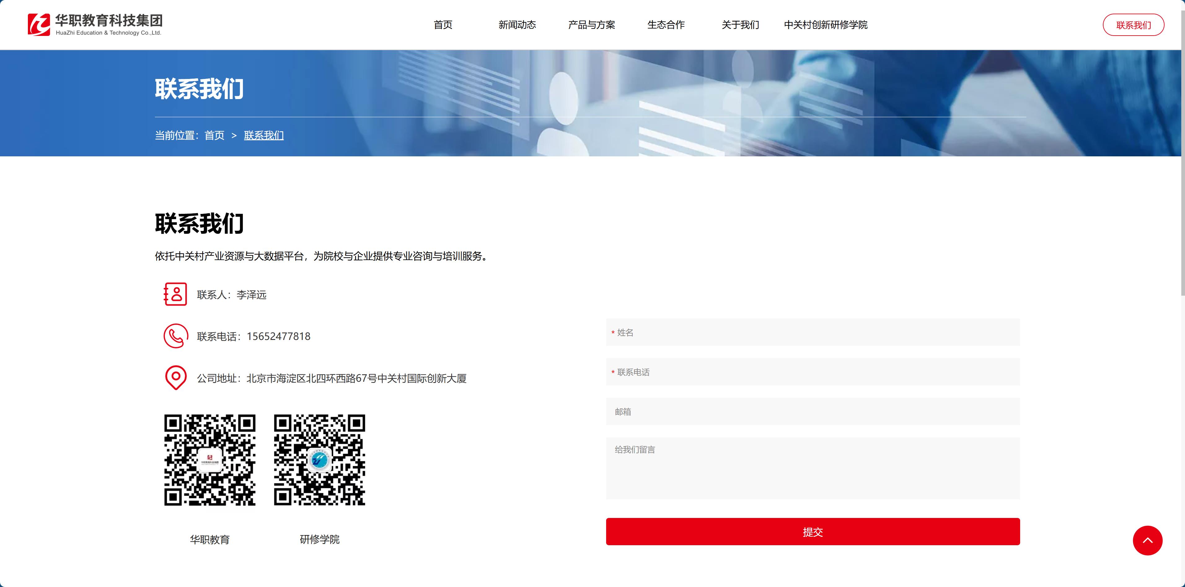
The form keeps only four fields: name, phone, email, and message. College and university clients tend to call first; the form is a supplementary channel, and the more fields there are, the fewer people dare to leave information.

Contact information and address appear again in the footer. Some people start reading from the very bottom of the page, especially those looking for the address.

chiheng7.jpg

The real workload lies in content migration.

The real workload for this site lies in the content, not the design mockups.

Two brands, three business lines, dozens of product pages, hundreds of news posts, eight years of accumulated material. The design mockups are only the skeleton; the work is moving the material into the new structure: unifying heading hierarchies, unifying how numbers are defined, reclassifying long WeChat articles by business line, and gathering cases scattered across the site into three groups.

A site like this has to be fed content continuously after launch, so the section structure must leave room for expansion—you can't block off future content just to keep things tidy today.

Whether a project like this succeeds isn't judged by how the first screen looks. It's judged by whether a department director at a college, opening it three times in one week, can find what he needs within two clicks each time: where the qualifications are, where the cases are, how to get in touch.

If he can find them, the site works. If he can't, then no matter how refined the visuals, it's just a pretty cover.

chiheng8.jpg